Styling
From the main navigation menu, click Styling.
This screen gives you two panels to work with, one for the Light Theme and one for the Dark Theme. These represents the light/dark versions of the customer self-service portal that your customers will be able to switch between to suit their own preferences.


Each panel gives you two items to adjust, firstly the Logo.
Whilst everyone's logo differs, in most scenarios you'll want to aim to have the smallest edge be 150px. For best results give your logo a transparent background instead of trying to match the portal's background colour.
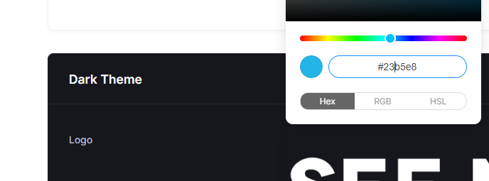
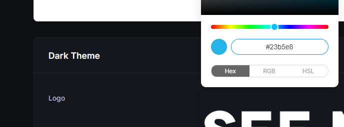
Lastly, you're able to adjust the Primary Colour, which could be your brand's primary accent colour. Ultimately something that works well with your brand and contrasts nicely with the background.
Once you're satisfied with your changes, click the Save Changes button to complete the process.